STYLISH - Metro Multi-Purpose WordPress Theme (Corporate)

STYLISH – Is a clean and responsive design that comes with rich tools and options to make creating website incredibly simple. With a tons elements of Stylish, you can use this theme for any purposes. Such as Business, Portfolio, Personal, Showcase, Blog or Landing Page.
After over 500 hours of hard work (around 100 hours for design, 350 hours for HTML/CSS and 50 hours for documentation and brainstroming) we have finally launched our “STYLISH – Metro Inspired Multi-Purpose WordPress Theme” on themeforest.net. First of all I would like to thank Adrian Holobut (our amazing Front-End and WordPress Developer) for his hard work, attention to detail, high quality work (and when I say “QUALITY” I really mean it) and for the detailed documentation. Also I want to thank Lisias Pop (our Support Member) for his patience, high communication skills and professionalism in issues solving.

Features
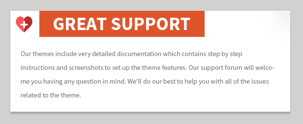
- Dedicated Support
- XML Demo Content Included
- HTML Template included
- PDF files included
- Responsive & Retina Ready
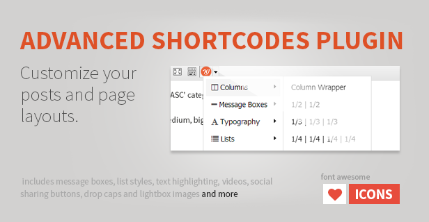
- Graphically Shortcode Generator
- Lots of Shortcodes
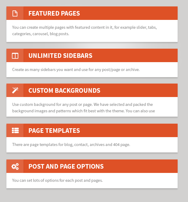
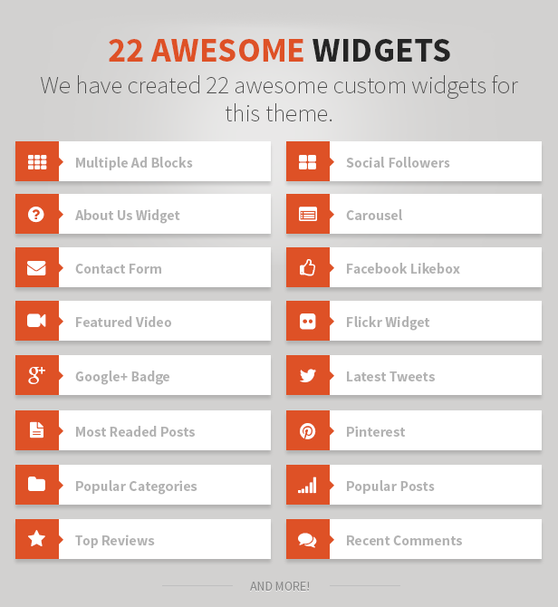
- Widget ready ( sidebar )
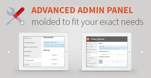
- Easy to setup, Theme Options Page
- Custom Logo and Favicon supported
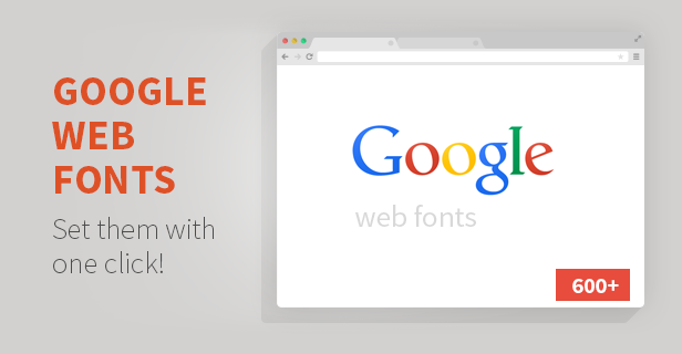
- Typography; Google Web Fonts supported
- Custom CSS supported
- Homepage contents supported
- Slider supported
- 37 HTML & CSS Predefined Templates
- Infinite Color Schemes, via color picker
- Built-in Contact form, options and email validation
- “Load More” type Pagination
- Social icons
- Blog options
- Footer message supported
- Stats code supported
- Customizable Menu
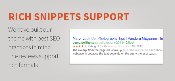
- SEO Optimized
- Retina Font Icons
- Clean code, without warnings and notices
- Child Theme Ready
- Wordpress 3+ Ready
- Bootstrap Framework // Standard resolution ~ 1170px (You can switch to 960px if you want).
- HTML5 and CSS3
- Responsive layouts
- Over 300 icons
- Lots of components
- Startup markup for each component
- Google maps
- Layouts animations
- And much more…
Premium Features
- Dynamically add more items to your portfolio or blog
- Revolution Slider
- Magical layouts with Isotope Plugin
- Beautiful quote animations
- And much more…
36 HTML Files
- accordions-toggles.html
- blog-grid.html
- blog-grid-sidebar.html
- blog-single.html
- blog-standard.html
- buttons-social.html
- columns.html
- content-boxes.html
- font-awesome.html
- full-width-section.html
- gallery.html
- google-maps.html
- home-basic.html
- home-creative.html
- index.html
- latest-posts.html
- latest-work.html
- media.html
- message-boxes.html
- page-404.html
- page-contact.html
- page-elements.html
- page-full-width.html
- page-pricing-tables.html
- page-services.html
- page-sidebar.html
- page-team.html
- page-typography.html
- persons.html
- portfolio-2columns.html
- portfolio-4columns.html
- portfolio-masonry.html
- portfolio-single.html
- skills-bar.html
- sliders.html
- tabs.html
18 PSD Files
- 404-error-page.psd
- blog-grid.psd
- blog-grid-sidebar.psd
- blog-standard.psd
- contact-page.psd
- homepage-hover.psd
- our-team.psd
- page-elements.psd
- page-full-width.psd
- page-sidebar.psd
- portfolio-2-columns.psd
- portfolio-4-columns.psd
- pricing-tables.psd
- services.psd
- single-portfolio.psd
- single-post.psd
- sortable-portfolio.psd
- typography.psd
Photo Credits:
- http://bakea.tumblr.com/archive
- http://creattica.com/logos/almacen-pe/94645
- http://creattica.com/logos/oneoak-menswear/94632
- http://creattica.com/logos/rogues-gallery/94480
- http://creattica.com/logos/buena-vista-event-management/94110
- http://creattica.com/logos/crossfit-olympus/97395
- http://creattica.com/logos/sweet-drops/93517
Read more
themeforest.net